
designership
Redesigning the BBdaily Mobile App.
THE OBJECTIVE
The main objective of this project was to redesign the Bigbasket Daily app flow. The task was maintaining its functionality and structure while giving it a fresh, visually appealing look. The goal was to improve the overall UI, ensuring consistency and enhancing user experience.
Timeline
A Weekend`
THE EVALUATION
A comprehensive heuristic evaluation of the current app screens and user flow was conducted to inform the redesign process. This evaluation identified several usability issues based on established principles. During the assessment, I observed the following:
Inconsistency: There are numerous inconsistencies throughout the app, particularly in button styles and chips.
Aesthetic Appeal: The design lacks vibrancy, with dull colors that do not provide a fresh feel.
Font Appeal: The fonts used are not as engaging or attractive as those found in other grocery apps.
Consistency and Standards: The app does not adhere to consistent design standards, leading to a disjointed user experience.
Aesthetic and Minimalist Design: The overall design does not strike an effective balance between aesthetics and minimalism.


THE FINAL DESIGN
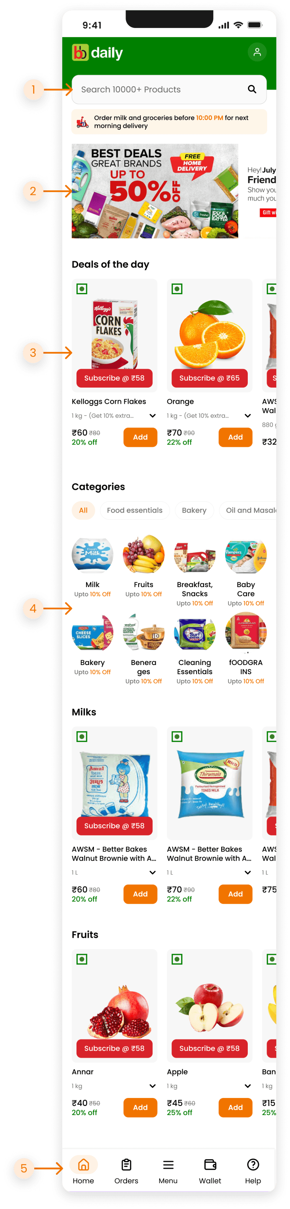
Home Screen
For the home screen, it is crucial to provide users with easy, clear, and accessible navigation. Additionally, separating different sections is important to create a clear visual hierarchy. To avoid user confusion, it's essential to minimize the number of options and categorize them effectively.
Pointer 1
Keeping the scrollbar at the top even when the user scrolls ensures that important navigation options remain accessible
Pointer 2
The two slider promotional sections were merged into only one as the slider can have multiple cards.
Pointer 3
The redesigned product cards have been enhanced for better accessibility and usability. They now feature clear and accessible actions while maintaining a strong visual hierarchy, regardless of the variety of products they display
Pointer 4
To improve the usability and navigation of the categories section, it is now organized with minimized options to help users make choices more easily
Pointer 5
To improve accessibility and ease of use, the menu option has been moved from the top to the bottom navigation bar, making it closer to the user's thumb for easier access
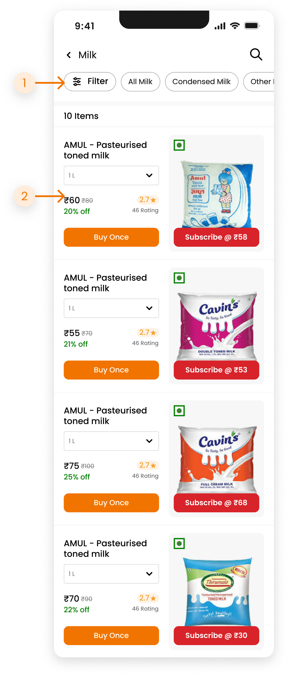
Product Listing
Pointer 1
The Filter CTA and quick filter were brought to same section as they both provide same functionality of filtering the products list.
Pointer 2
Again the redesigned product cards have been enhanced for better accessibility and usability.
Enhanced visibility with highlighted prices and discounts. Prominent display of product ratings.
Related data has been grouped together such as -
Price and offer
Overall and Total rating stats
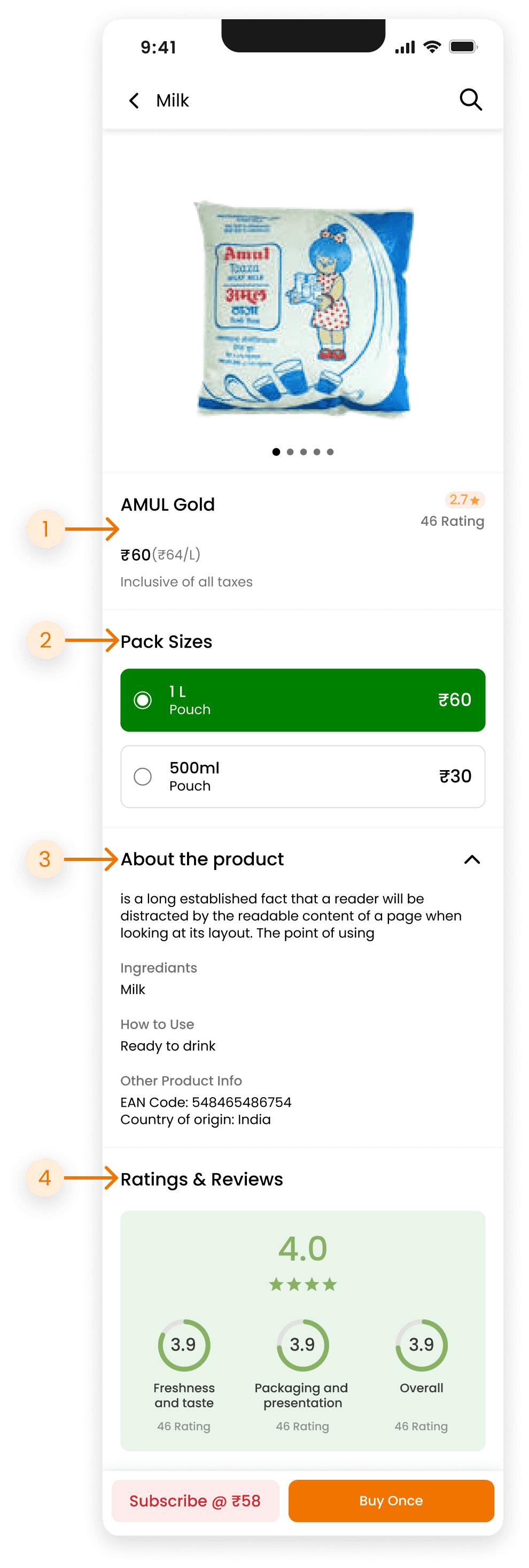
Product Details
Pointer 1
Changed the layout by moving the image slider and product detail section, as users are used to view product in following pattern
Pointer 2
The pack sizes section is now more attention-grabbing, with clearly visible selected pack sizes.
Pointer 3
Previously, all the different details had separate collapse features, but reducing it to only showing a chevron icon parallel to the "About the product" text has minimized unnecessary actions.
Pointer 4
Redesigned the rating and review section to be more user-friendly. The overall rating now includes specific areas, making it clearer for users.
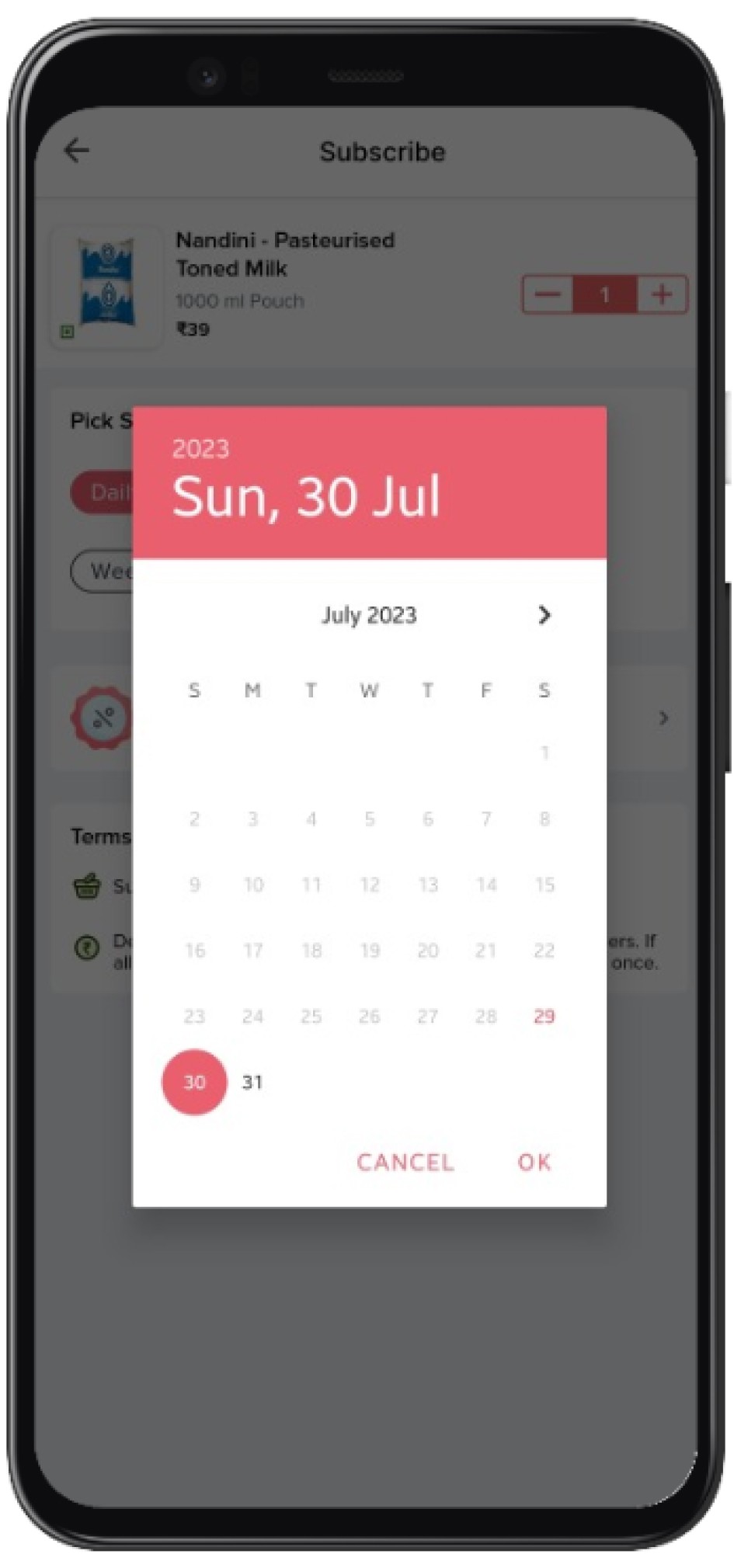
Subscription Screen
Pointer 1
At the top, there is a product that the user can subscribe to. The user can adjust the quantity, with the total price displayed just below the increase and decrease buttons.
Pointer 2
The pick schedule section has three conditional sections displayed as follows:
Top: The user selects the delivery frequency using select chips for quick actions.
Middle: The current date is displayed, which the user can change if desired.
Bottom: If the frequency is set to weekly, the user will see the delivery days section, also presented in select chip form for quick actions. This eliminates the need for a button and bottom sheet, providing a clear view of the current selections.
Pointer 3
The Coupon, Delivery Details, and Terms and Conditions sections follow the same design pattern, each featuring a different icon for easy recognition without reading the content. Additionally, the delivery address section displays a portion of the address for quick reference.

THE BRICKS
A walked through designing the new product card, ensuring it was accessible and included all the necessary data from the current UI. I provided ample white space for clarity and established a clear hierarchy within the card design.
